The best financial advisor websites of 2026: 12 real examples
The best financial advisor websites aren’t the flashiest. They’re the ones that make who they serve, where, and how they’re paid obvious in seconds, and several of the sites below are ranking on Google for niche searches because of it. Here are twelve real examples, each with the one thing it does well that you can use on your own site.
The 12 websites

1. Modern Family Finance: outcomes in the hero, pricing in the menu
The headline says who it's for (“modern families”) and the four lines under it say what changes for them: lower taxes, mindful investing, equity, independence. “Services & Pricing” sits in the main menu, and NAPFA and CFP® marks appear right below the first screen.
In search: Appeared on the first page of Google for “financial advisor for tech employees,” with a dedicated tech-employees page.
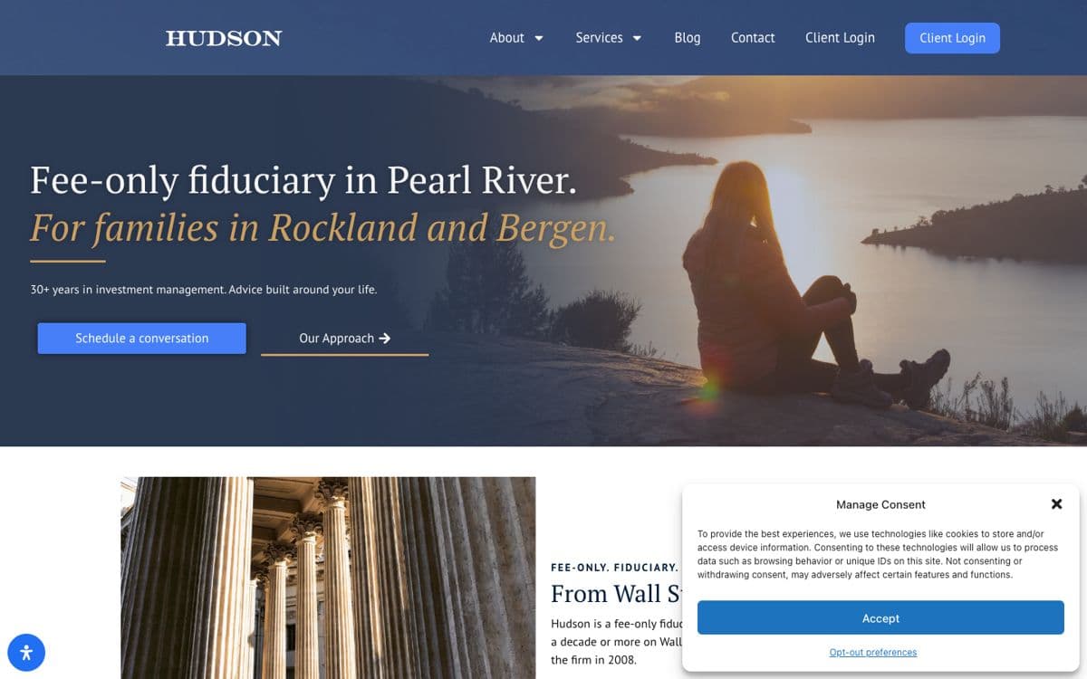
2. Hudson: a headline that names the place
“Fee-only fiduciary in Pearl River. For families in Rockland and Bergen.” In one line a prospect knows the fee model, the town and the counties served. The italic second line gives it warmth without losing any clarity.
In search: Its page for New York educators appeared in Google’s top 20 for “financial planner for teachers.”
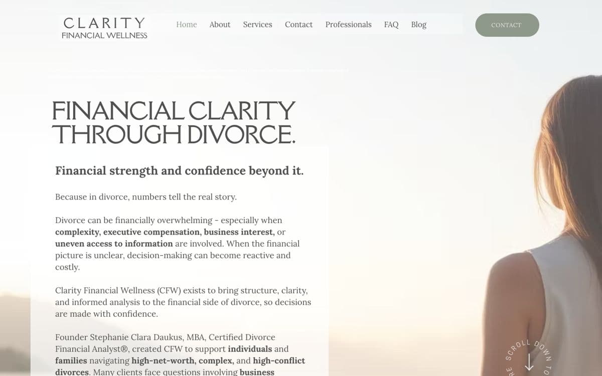
3. Clarity Financial Wellness: one niche, said plainly
“Financial clarity through divorce.” The whole site speaks to one moment in a client’s life, and the founder’s Certified Divorce Financial Analyst® credential appears on the first screen, where it matters most.
In search: Appeared in Google’s local map results for “financial advisor for divorce.”

4. Stash Wealth: a voice their clients actually use
“Get your financial sh*t together. You make good money. You want more to show for it.” It’s not for everyone, which is the point: the right prospect recognizes themselves instantly. A podcast in the main menu backs the voice with content.

5. Covenant Wealth Advisors: awards with the disclosures next to them
The headline names the niche (retirement) and the eyebrow names the cities. One orange call to action, “See if you’re a fit,” repeats everywhere. The awards row carries a disclosures link directly beneath it, the way the SEC Marketing Rule expects ratings to be presented.

6. Clark Asset Management: teach first, sell second
The first screen offers free retirement videos to watch before choosing an advisor, a lead magnet that builds trust before any sales conversation. “Flat Fee” has its own place in the menu, so the pricing model is never a mystery.
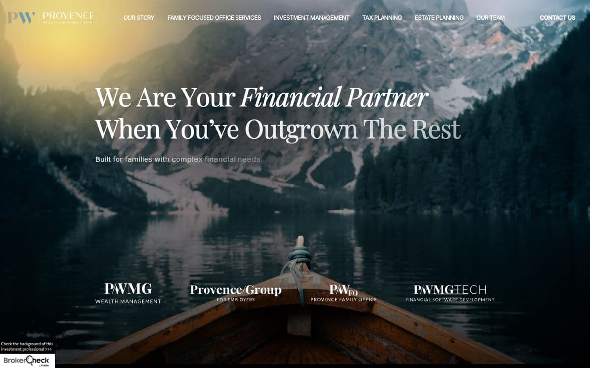
7. Provence Wealth Management Group: premium positioning, with the public record one click away
“We are your financial partner when you’ve outgrown the rest.” Cinematic photography and a serif headline signal a different tier of service. A BrokerCheck badge sits in the corner of the first screen, linking prospects straight to the firm’s public record.

8. Santiago: a modern look for a modern client
A dark, minimal first screen with one line, “Your pursuit begins here,” and a niche stated in the title: advisor to next-gen families and athletes. It looks nothing like a typical advisor site, which is exactly the signal it wants to send.
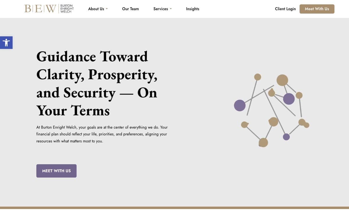
9. Burton Enright Welch: articles that win searches the homepage can’t
The homepage is a calm, classic fee-only pitch. The search work happens in the Insights section: a guide to financial planning for tech professionals that ranks for a niche the homepage never mentions.
In search: Its tech-professionals guide appeared on the first page of Google for “financial advisor for tech employees.”
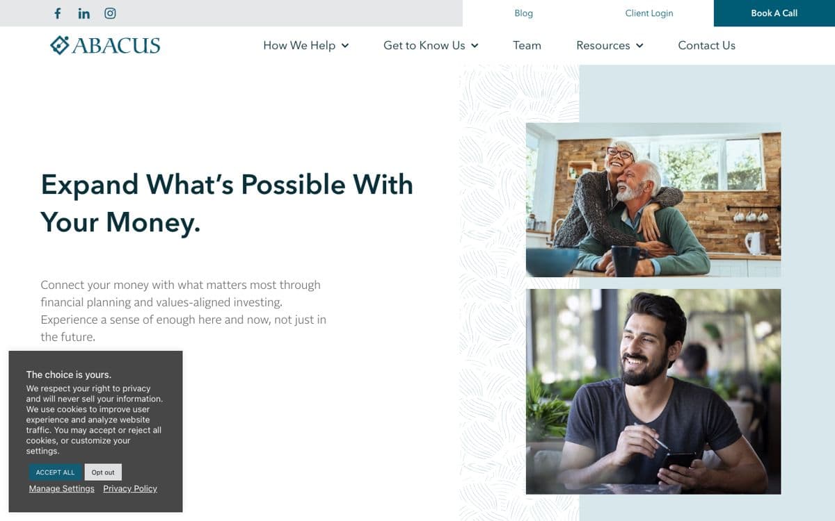
10. Abacus Wealth Partners: the next step always in reach
“Expand what’s possible with your money.” A utility bar keeps “Book a Call” in the top-right corner of the page, so the next step is one click away however far a visitor reads.
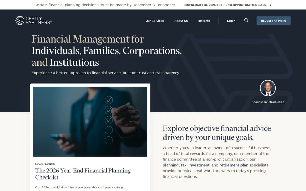
11. Cerity Partners: timely content as the front door
A slim banner at the top of the page offers a 2026 year-end opportunities guide, tied to a real deadline. Timely, useful content gives visitors a reason to leave an email even if they aren’t ready to talk.
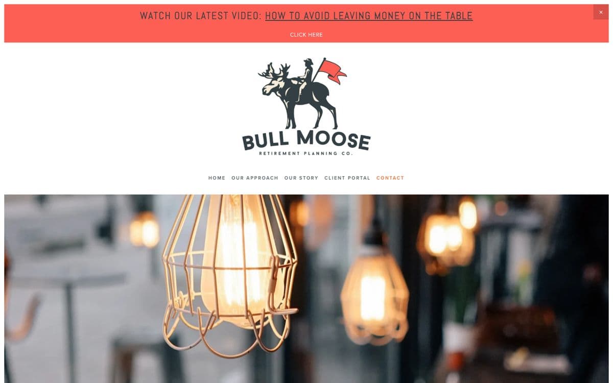
12. Bull Moose Retirement Planning: a brand with personality
An illustrated moose with a rider and a flag, and the line “dare mighty things.” It’s memorable in a category full of lookalike logos, and a video banner at the top gives the brand a voice.
Seven patterns they share
| Pattern | Seen on |
|---|---|
| Say who, where and how you’re paid in the first screen. | Hudson, Clarity, Covenant |
| Give each niche its own page. | Modern Family Finance, Hudson |
| Put pricing in the menu. | Modern Family Finance, Clark, Covenant |
| Show credentials and the public record up front. | Clarity, Provence, Modern Family Finance |
| Use one call to action, everywhere. | Covenant, Abacus |
| Let articles win the searches the homepage can’t. | Burton Enright Welch |
| Sound like your clients. | Stash Wealth, Santiago |
Most of these are content and structure decisions, not design flourishes. We go through each in our guide to financial advisor website design.
How we chose them
We started from live Google results on October 30, 2026 for niche advisor searches, such as “financial advisor for tech employees,” “financial planner for teachers” and “financial advisor for divorce,” and noted which independent firms’ sites appeared. We added firms featured in recent advisor website roundups, screenshotted each homepage the same day, and kept the twelve that each do one thing especially well.
Screenshots show each homepage’s first screen as it appeared on October 30, 2026; sites change, so yours may look different. No firm paid or asked to be included, and inclusion is not an endorsement of any firm’s advisory services.
Questions advisors ask
What makes a good financial advisor website?
It tells the right prospect within seconds who you serve, where, and how you're paid; it answers their questions about fees, process and credentials in plain language; it makes the next step obvious; and it's built so Google and AI tools can understand it.
How did you choose these websites?
We started with independent advisory firms whose sites appeared in Google for niche searches in our October 30, 2026 search data, added firms featured in recent design roundups, and kept the twelve that each do one thing especially well. No firm paid or asked to be included.
Is this list an endorsement of these advisors?
No. It's a review of website design and search visibility only, not of any firm's advice, performance or suitability.
Should my advisor website look like these?
Borrow the patterns, not the look. The common thread is clarity about who the firm serves, which is specific to you.